CASE STUDY 04 / 04
Website designed · Mobile and web app in progress
PROFESSIONAL NETWORKING · NFC
WEB · MOBILE PRODUCT
MyKansi — NFC-powered digital presence

Designing the digital experience behind better professional connections.

MyKansi lets people share their profile, portfolio, contact details and social links in a tap, through NFC cards, QR codes and digital wallets. I designed the website that explains the product and helps visitors decide what's right for them.
RoleProduct Designer
StatusWebsite designed · Mobile and web app in progress
CategoryProfessional networking · NFC · Web · Mobile
ScopeProduct thinking, UX strategy, information architecture, UX/UI, responsive web design, prototyping
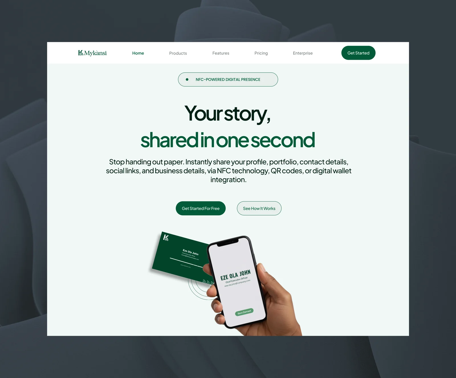
MyKansi website homepage — 'Your story, shared in one second' with an NFC card and phone
MYKANSI — WEBSITE HOMEPAGE
THE CHALLENGE

MyKansi needed a digital experience that could explain a product with a lot going on.

The website had to communicate several things at once: what MyKansi is, why someone would use it, how the experience works, what features are available, the NFC cards and hardware, and the plans and how they differ.

The challenge wasn't simply to make the website look good. It was to make the product easier to understand, and give visitors a clear path from discovering MyKansi to deciding what makes sense for them.

“Each section should have a job — explain, build confidence, compare, or move the user forward.”
— the principle behind the website's structure
THE THOUGHT PROCESS

Structure first.
Screens second.

01

Start with the product, not the visuals

Before designing anything, I listed the questions a new visitor would naturally have: What is MyKansi? How does it work? What can I actually do with it? What do I get? Which option is right for me? Those questions shaped the information architecture and the order of the website.

02

Make the value obvious early

The homepage needed to communicate the core proposition quickly, rather than making people search the website to understand the product. Each part of the page answers the next question a visitor is likely to have.

03

Design for different levels of interest

Visitors don't all arrive with the same intent. Some want a quick understanding. Some want to explore features. Some are already considering a purchase and want to compare plans, pricing or hardware. The website supports each of them through product benefits, how it works, feature comparisons, pricing, NFC cards and hardware, and FAQs.

What it is
→
How it works
→
What you can do
→
Why it matters
→
What to choose next
KEY DESIGN DECISIONS

Turning the thinking
into the experience.

01

Clear product introduction

The homepage opens by establishing what MyKansi is and what it offers: share your profile, portfolio and contact details instantly through NFC, QR codes or a digital wallet.

02

Visual product explanation

Product previews show the card and the profile it opens, making the digital experience tangible instead of relying entirely on marketing copy.

03

Feature comparison

A comparison table makes the differences between plans and features easy to scan, reducing the effort it takes to choose.

04

Plans and pricing

The pricing section continues the decision-making journey, helping visitors understand their options once they know what the product does.

05

NFC cards & hardware

The website connects the physical NFC card to the wider digital MyKansi experience, so the hardware reads as part of the product, not a separate purchase.

THE WEBSITE

Designed for the full journey.

From discovering MyKansi to understanding the product, comparing options and choosing a plan, the website was designed to make the journey feel clear and intentional.

MYKANSI — WEBSITE MOTION WALKTHROUGH

Want to explore the experience yourself?

View the live website ↗
WHAT I'M WORKING ON NEXT
The mobile experience is still in progress.

The website is the first part of the MyKansi experience I've brought to completion.

The mobile product is currently being designed, with the goal of carrying the same principles into the product experience itself while accounting for the different needs of a mobile application.

So this case study is still evolving.

WHERE THIS STANDS
Information architecture
Complete
Website design
Complete
Live website
Live
Mobile & web app
In progress
WHAT I LEARNED

Product design isn't always about adding more.

When a product has multiple features, plans, hardware and use cases, the natural temptation is to explain everything.

The real design challenge is deciding what users need to know, when they need to know it, and what they should be able to do with that information.

For MyKansi, the website became less about presenting a collection of features and more about building a clear path from curiosity to understanding to action.

WHAT I BROUGHT TO THIS PROJECT
Product thinking

Started from the questions a new visitor needs answered.

UX strategy

Designed for visitors with different levels of intent.

Information architecture

Gave every section a clear job in the journey.

UX/UI design

Designed the full website experience.

Responsive web design

Built the experience to work across screen sizes.

Prototyping

Brought the journey to life through motion.

MORE CASE STUDIES