CASE STUDY 01 / 03
Launched product
FINTECH · MOBILE
0→1 PRODUCT DESIGN
MoveFinance — publicly launched as Reeple.ai

Simple enough to use.
Transparent enough to trust.

I designed the Get Virtual Card experience for a fintech product helping immigrants navigate international payments and financial services — from the first explanation screen to secure, authenticated card access.

RoleProduct Design Intern
TimelineAug 2023 – Dec 2023
TeamTheNovelBrand / Framer Dojo
ContributionUX strategy, flows, interaction & UI design, prototyping
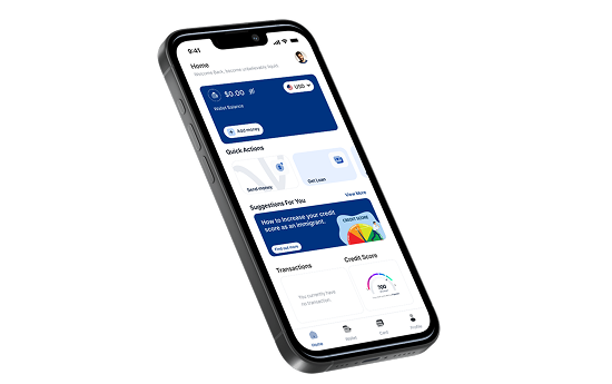
MoveFinance app — home screen on iPhone 16
MOVEFINANCE — GET VIRTUAL CARD FLOW
THE SHORT VERSION

MoveFinance (publicly launched as Reeple.ai) helps immigrants manage financial needs — international transfers, credit, and loans — in a system that often isn't built with them in mind.

I designed the Get Virtual Card experience: the flow that lets a user request, understand the cost of, and securely access a virtual card for online transactions. I worked alongside senior product designers and the wider product team, and owned this flow from research through to handoff.

STATUSDesigned, prototyped, handed off — launched as part of the product
SCOPE5-step flow, designed 0→1
FOCUSClarity, cost transparency, financial trust
HANDOFFHigh-fidelity design + interactive prototype → engineering
THE CONTEXT

For someone navigating a new financial system, getting access to financial products can already feel complicated.

MoveFinance was built to help immigrants manage the financial needs that come with settling somewhere new — international transfers, credit, loans. As part of the product, users needed a way to get a virtual card they could use for online transactions without needing a physical one.

The brief wasn't simply "design a card screen." It was a set of open questions the product team needed answered: what does a user need to know before getting the card? What information should they provide? What choices should they be able to make? How do we make fees and funding information clear — and how do we protect sensitive card details once the card exists?

The goal was to make the experience feel simple enough to use and transparent enough to trust.
“The interface wasn't designed to hide the complexity of the product. It was designed to organise that complexity around the user's decisions.”
— on the finished Get Virtual Card experience
THE PROBLEM

It wasn't one screen.
It was four unanswered questions.

01

Unclear requirements

What does a user need to know before getting the card, and what information are they actually expected to provide? Neither was obvious from the raw product requirement.

02

Invisible costs

Fees and funding information had to be clear before a user committed — not buried in a settings page or discovered after the fact.

03

Security vs. convenience

The card needed to be genuinely useful for everyday online transactions, without exposing sensitive credentials — PAN, CVV, expiry — by default.

FINDING THE REAL PROBLEM

Understanding the users

The wider product team's research involved conversations with people navigating unfamiliar financial systems — particularly immigrants dealing with credit, transfers and financial services for the first time. I drew on that research to understand where users experienced confusion, uncertainty and mistrust, and to shape the virtual-card flow specifically.

User & stakeholder
conversations
Financial information wasn't always easy to understand — users needed clearer explanations around things like credit, eligibility and financial products in general.
Behavioural
patterns observed
When users weren't sure what was required, or what would happen next, they were more likely to hesitate or abandon the action entirely.
Trust & transparency
signals
Users wanted to understand costs, progress, and exactly what they were agreeing to — before committing to anything.
WHAT THE RESEARCH CHANGED

Three themes shaped
every decision that followed.

01

Financial information wasn't the barrier. Understanding it was.

Users didn't need less information — they needed it explained in language that didn't assume prior financial literacy.

Design implication

Lead every step with plain-language context before asking for a decision — starting with why the card is useful at all.

03

Trust was a function of transparency, not reassurance.

Friendly copy didn't build trust on its own. Seeing real costs and terms before confirming did.

Design implication

Surface fees, funding source and terms in a dedicated review step — before card creation, not after.

TURNING INSIGHTS INTO A PRODUCT DIRECTION

From requirement to experience

Give users access to a virtual card they could use for online transactions. That was the whole requirement.

Turning it into an experience meant accounting for everything between "user has no card" and "user is confidently using one" — KYC context, application, card selection, fees and funding, creation, and secure ongoing access. The challenge was keeping all of it understandable without the process feeling like a financial form.

Rather than starting from individual screens, I started from the information a user needed at each stage — then let the screens follow from that.

KYC
→
Card application
→
Card selection
→
Fees & funding
→
Card creation
→
Secure access
BEFORE IT LOOKED LIKE THIS

Early exploration

What I tested

A simple, guided flow for getting a virtual card. Introduce the card, explain a few benefits, confirm the one-time charge, and let the user create it. Keep it short.

What didn't work

The flow was too vague. The screens told users what they could get, but not enough about how it worked, what they were agreeing to, or what choices they had. The charge appeared before users had enough context to understand why they were being charged — or what would happen next.

For users already cautious about financial products, the interface was asking them to trust before giving them enough information to do so. The simplicity was actually creating uncertainty.

What changed

We moved from a "quick creation" approach to a more transparent flow that gave users more control and context before committing. Instead of rushing toward card creation, the revised experience explained the requirements, surfaced the relevant choices and made the consequences of each decision clearer.

The lesson: reducing steps isn't always reducing friction. Sometimes, clarity is the friction remover.

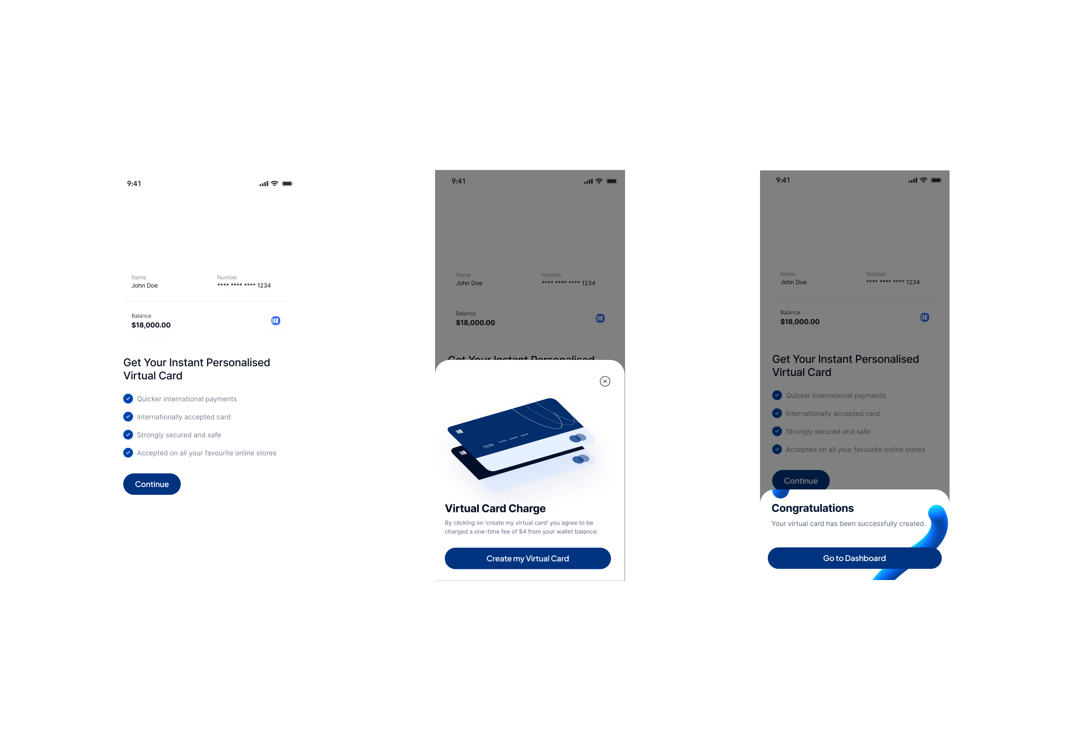
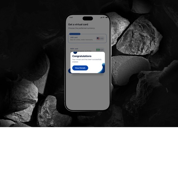
MoveFinance early wireframes — introduction screen, virtual card charge sheet, and success state
Fee disclosure as a
separate commitment moment
Screen 01
Introduction
The card's value and benefits — but without enough context for a cautious user to feel confident continuing.
Screen 02 — The problem
Virtual Card Charge
The fee appeared in a bottom sheet before users had enough context to understand what they were agreeing to — or why.
Screen 03
Congratulations
Success state was clear — but the flow leading here asked for trust before earning it.
BUILDING WITHIN THE SYSTEM

Designing inside an existing brand

This wasn't a 0→1 design system. It was 0→1 inside one that already existed.

MoveFinance's visual and component system belonged to the wider product — under NDA, so the specific tokens aren't shown here. My job was to work fluently inside those constraints: apply existing components and patterns to a flow that hadn't been designed yet, and flag where the card experience needed something the system didn't have.

THE FINAL EXPERIENCE

Five moments,
one decision each.

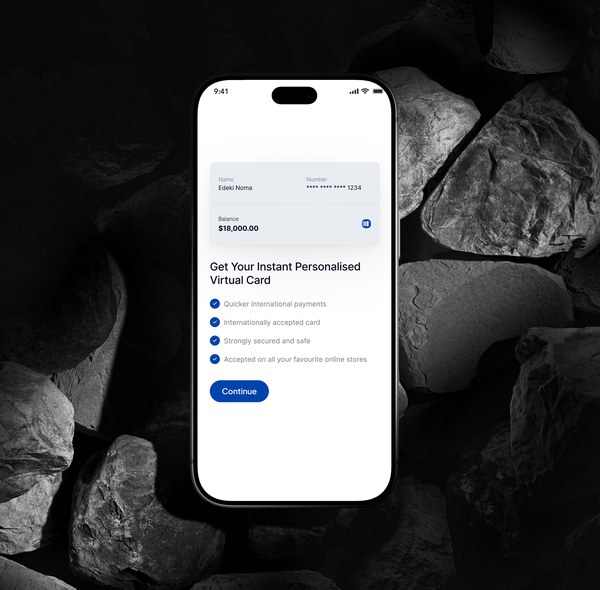
01

Explain the value before asking for information

The first screen introduces the virtual card and gives users a reason to continue, highlighting:

  • Faster international payments
  • International acceptance
  • Security
  • Online usage
Why

Before asking users to complete a financial process, I wanted the experience to establish what they were getting and why it was useful.

Screen 1
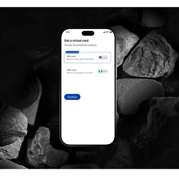
02

Help users choose the right card

Screen 2

Users chose between the available card options based on how they intended to use the card — presented together with contextual information, not buried in settings.

  • USD card — best for online and dollar transactions
  • NGN card — best for local spending
Why

The choice should be understandable from how the user intends to spend, not from understanding the underlying financial system first.

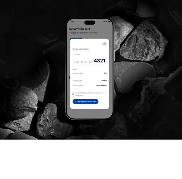
03

Make the financial commitment visible

Before creating the card, a review step showed the details that actually mattered:

  • Card type & card details preview
  • Issuance fee & monthly fee
  • Funding source
  • Terms and fee schedule
Why

Financial products have a particularly high cost of ambiguity. Users needed to see the important information before confirming, not discover it after the card existed.

The trade-off: this makes the flow slightly longer. Here, transparency mattered more than removing every possible step.

Screen 3
04

Give users a clear confirmation

Screen 4

Once the card was created, the success state confirmed what had happened and pointed to a direct next action: View Details.

Why

The user had just completed a financial action. The interface needed to clearly communicate success and immediately point them toward the next useful step.

05

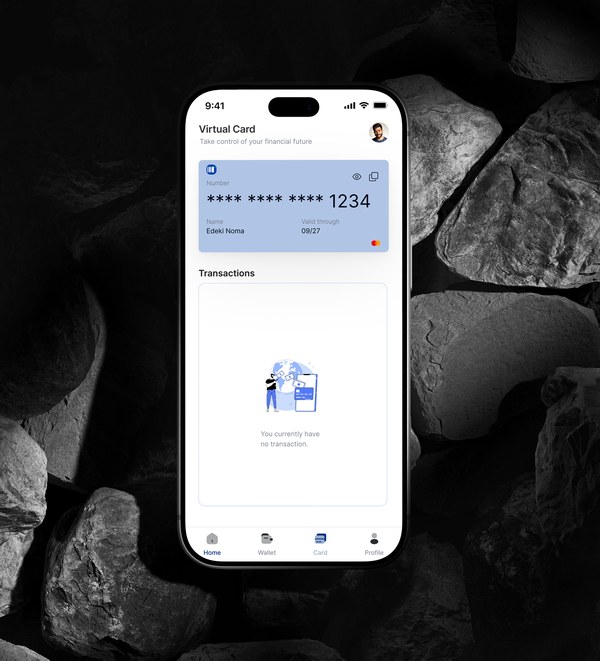
Protect sensitive card information

Once the card existed, users could access their card info from the card area. Sensitive details — PAN, CVV, expiry date — sat behind an authentication gate rather than being freely exposed.

Why

Convenient enough to use online, but convenience shouldn't mean displaying sensitive financial credentials openly.

Screen 5
HOW IT WORKS

One flow,
several product decisions.

The final experience looks relatively simple. That simplicity came from deciding what the user actually needed to see at each point in the journey.

Make the card choice contextual

Each option explained its intended use, reducing the financial knowledge a user needed before choosing.

Show costs before commitment

Fees and funding surfaced in a dedicated review step — slightly longer, but fully informed.

Don't expose sensitive data by default

Accessible from the product, but sensitive credentials required authentication first.

Keep the experience focused

Not every technical detail — just enough for the user to make the next decision confidently.

MAKING IT REAL

Handoff & launch

I don't design in a vacuum.

The completed experience was handed over to the wider product team for implementation. I worked within a team that included senior product designers and other product contributors, translating the flow into high-fidelity designs and interactive prototypes engineering could build from.

The product subsequently launched as part of MoveFinance / Reeple.ai.

WHAT CHANGED

Honest about what I can — and can't — claim

Design
Complete
Prototype
Tested
Handoff
Delivered
Product
Launched

I handed this work over before post-launch measurement, so I don't attribute live-product performance metrics to it. What I can confidently show is the design work, the research behind it, the decisions I made, and the resulting product experience.

WHAT I'D MEASURE AFTER LAUNCH

Card application completion

Where do users abandon the process?

Card creation rate

How many eligible users who begin the flow successfully create a card?

Time to card creation

How long from starting the flow to having a usable card?

First transaction

How many newly created cards actually get used?

Card-detail access

Can users retrieve their card information without needing support?

LOOKING BACK

This was one of my first chances to design a fintech feature 0→1 — and the biggest lesson wasn't about designing a virtual card.

It was understanding that financial UX is often a problem of clarity and trust. A user may be perfectly capable of completing a form or tapping a button — the harder question is whether they understand what they're agreeing to, what their money is doing, and what happens next.

A simpler interface isn't necessarily one with fewer elements. It's one where the user doesn't have to work unnecessarily hard to understand what they're being asked to do.

Reducing friction isn't always about removing steps. Sometimes the better solution is making the next step obvious — even if it takes one screen more.

Trust in a financial product isn't built with reassuring copy. It's built by showing real numbers before asking someone to commit.

Testing and research kept pointing to the same things: clear language, visible requirements, visible costs, fewer surprises.

THE PRINCIPLE THIS SHAPED
Explain→ Simplify→ Make costs visible→ Protect sensitive information→ Give the user control
WHAT I BROUGHT TO THIS PROJECT
Research-informed thinking

Using real user research to understand financial confusion and trust barriers.

0→1 product design

Turning a product requirement into a complete virtual-card experience.

Interaction design

Structuring the flow around user decisions, not individual screens.

Financial UX

Balancing simplicity, transparency and security.

Collaboration

Working alongside senior designers and the product team through to handoff.

MORE CASE STUDIES
02
Oloja→
Marketplace · Trust · Negotiation
A service marketplace designed around transparent offers, negotiation and secure transactions.
03
AI Customer Assistant→
AI Product · Conversational UX · Human-in-the-loop
Exploring how AI can manage routine customer conversations while knowing when to hand control back to a human.
+
Other Projects→
Websites · Henna Place · Trian Energy
Selected website projects, including Henna Place and Trian Energy.